I've just been messing around with my
Manchester political meetings sites data 1779-1848 using Google Fusion Tables 'experimental' facility. Not quite sure what the connections show other than visualising what's numerically obvious (radicals and loyalists like the pub; Chartists have a strong connection with open spaces) but it looks nice.
I've embedded some of the visualisations at the bottom. The fist plots the sites against types of political group (Chartist, loyalist, trade union, etc), and 'weights' them by latitude. Again, no idea what that really means, and it reminds me somewhat of
a Wordle, which is a pretty visualisation of frequency of words but doesn't really give you more than you actually know about the data. The second one plots types of group with types of meeting site distinguished by colour. The third one compares the type of group with the name of the site of meeting and 'weighted' by total number of occurrences. Will experiment further and see if this is of any use.
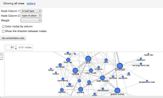 |
| types of meeting plotted against types of venue |
 |
| Types of meeting plotted against types of venue and weighted by date |
|
|


Comments
Post a Comment